


Can Rugs Be Colour Matched? A Designer’s Guide
- The Rug Story

- 1 day ago
- 6 min read
A rug can be the one element that makes an otherwise considered scheme feel slightly off. The blue is too cold beside the upholstery, the neutral reads pink against the stone, or a carefully selected accent disappears once it is translated into pile. So, can rugs be colour matched? Yes, but the most successful result comes from matching with material, light and construction in mind, rather than treating yarn like a printed paint swatch.
For interior designers, colour matching is less about pursuing an abstract ‘perfect’ shade and more about specifying a rug that holds its place confidently within the finished room. A bespoke hand-tufted rug gives far greater control over that relationship than an off-the-shelf piece, particularly where upholstery, joinery, wall finishes or artwork set a precise visual direction.
Can rugs be colour matched to a scheme?
They can. A specialist manufacturer can develop rug colours to sit alongside supplied references, whether that is a paint card, fabric cutting, wallcovering sample, timber stain or an existing colour standard. The process usually begins by identifying the reference that matters most and then reviewing yarn colour poms under appropriate conditions.
There is, however, an essential distinction between colour matching and colour copying. A colour seen on a flat painted surface will behave differently when it is dyed into wool, silk, Tencel or a blended yarn, then formed into thousands of individual tufts. The same nominal shade can appear deeper, softer or more lustrous according to the fibre and pile construction selected.
This is not a limitation to work around. It is where a well-specified rug becomes a design instrument. A muted green can be given more depth through cut pile, a mineral grey can take on movement through loop pile, and a two-colour design can introduce tonal relief without disrupting a quiet scheme.
Why an exact match is not always the right brief
A client may ask for a rug to match the curtains exactly, but a literal match can flatten the room. When floor and window treatments are the same value and temperature, the rug may lose definition, particularly in large, softly furnished spaces.
Often, the stronger approach is to specify a related shade: perhaps one value darker, with a slightly warmer undertone, or a quieter version of the dominant fabric colour. This gives the rug a clear relationship with the scheme while allowing it to ground furniture and frame the room.
The scale of the rug matters here. A colour that feels restrained on a 10 cm pom can feel substantial across a large drawing room or hotel suite. Equally, a small amount of contrast in a border, line or loop-pile detail may be enough to make a bespoke design read with intention. The designer’s eye remains central, but sampling turns instinct into a dependable specification.
The factors that change how rug colour reads
Colour poms are invaluable, though they are only one part of the decision. The final appearance of a hand-tufted rug is shaped by several connected variables:
Fibre choice:Wool tends to give colour a soft, naturally nuanced appearance. Silk and Tencel introduce lustre, which can make a shade appear brighter or lighter as the viewing angle changes.
Pile construction:Cut pile reflects light differently from loop pile. In cut and loop designs, the contrast in texture can make two similar shades appear more distinct.
Pile height and density: A deeper, denser pile creates a richer surface, while a lower construction can read cleaner and more graphic.
Lighting: Daylight, warm decorative lighting and commercial lighting can each alter perceived undertones. A greige that feels balanced in a studio may appear noticeably warmer in a south-facing room.
Surrounding finishes: Timber, marble, metalwork and painted joinery all influence the way a rug colour is seen. A pale neutral should never be approved in isolation.
This is why the phrase ‘colour match’ needs a practical brief behind it. Is the rug intended to disappear into the floor finish, bridge two competing colours, repeat a feature fabric, or provide a calm field beneath a patterned seating arrangement? The answer informs every subsequent choice.
Match under the light that matters
Where possible, assess colour poms in the project environment or under lighting that closely represents it. This is especially valuable for shades with complex undertones: off-whites, stone, mushroom, putty, blue-greys and soft greens are all capable of changing character across the day.
For hospitality and commercial projects, it is also worth considering the primary operating light rather than relying only on daylight. A restaurant may be experienced almost entirely in evening light, while a reception space needs to perform consistently from morning through late afternoon. A rug that looks exceptional in the sample review should remain convincing in use.
A considered process for bespoke colour matching
The clearest briefs tend to produce the best results. Start by supplying a physical reference where available, rather than relying solely on a screen image. Digital files are useful for communicating the overall concept, but screen calibration, photography and print reproduction can all shift colour.
Next, establish the fibre and construction before final colour approval. If the brief calls for a luminous, silk-like highlight, the selected yarn will affect the result. If durability, a matt appearance and a substantial underfoot feel are priorities, wool may lead the specification in a different direction. Colour should be reviewed in the material that will actually be used.
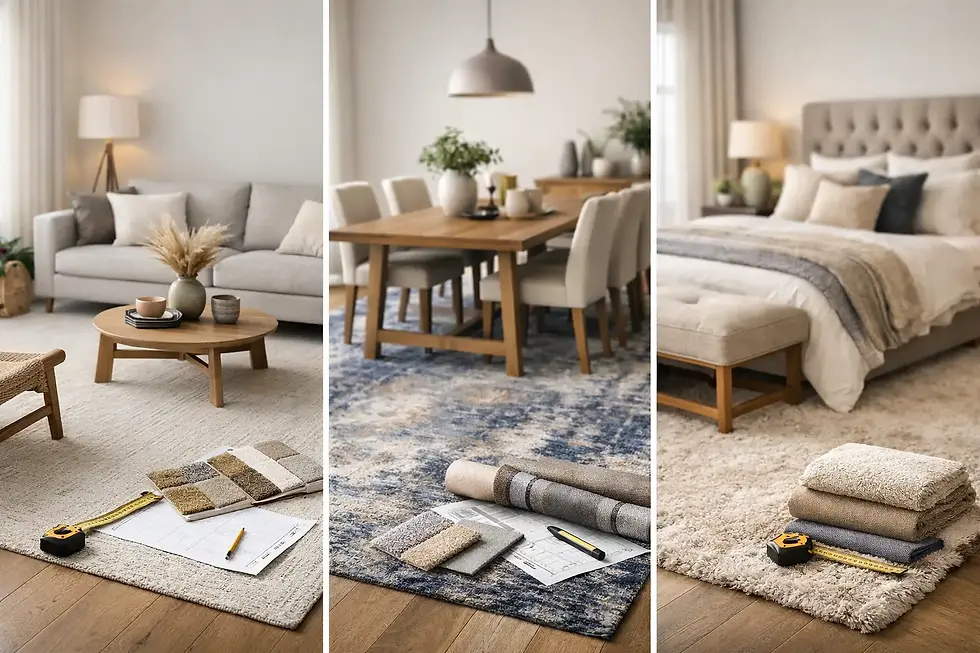
From there, compare a small family of poms rather than searching for a single immediate answer. Looking at a slightly warmer, cooler, lighter and deeper option reveals the undertone more clearly and makes it easier to judge the rug’s role within the room. For complex schemes, two or three yarn colours may produce a more convincing visual match than one flat shade.
A CAD drawing can then help show proportion, layout and the placement of colour across the design. It is particularly useful when working with borders, panels, organic motifs or cut-and-loop patterning. The drawing does not replace physical sampling, but it enables the design team and client to understand how the colour story will occupy the floor.
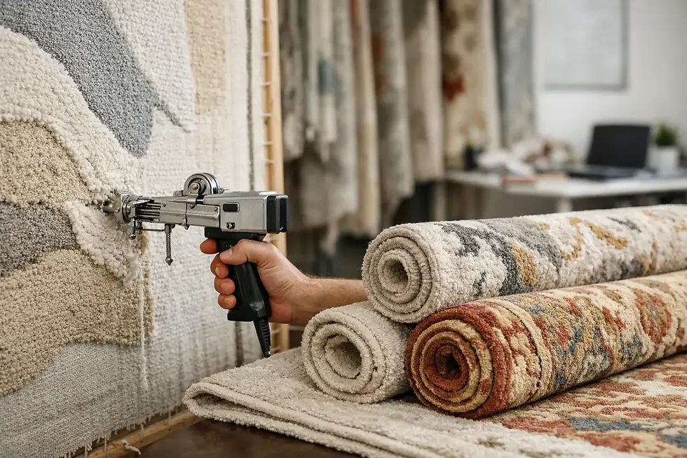
At The Rug Story, this consultation-led approach can include colour poms, CAD visualisation and guidance on fibre, size and fitting, allowing designers to develop a rug specification with both aesthetic clarity and practical confidence.
When a two-colour rug solves the problem better
Some rooms ask too much of one shade. A single-colour rug may need to connect a warm ivory sofa, charcoal joinery and blue-grey wall finish, while still sitting comfortably against an oak floor. In these cases, a quiet two-colour construction often resolves the tension more elegantly than forcing one neutral to do every job.
A fine linear contrast, tonal border or alternating cut-and-loop pattern can blend the key notes of the scheme. The effect can be almost imperceptible from a distance, yet it gives the rug texture, depth and a stronger sense of belonging. Designs with restrained colour placement are particularly effective in high-end residential settings where the floor needs presence without visual noise.
The trade-off is that subtle pattern needs sufficient scale to be legible. On a smaller rug, too many tones or intricate details may become busy. On a generous room-sized rug, however, a carefully judged secondary colour can prevent a large expanse of pile from feeling flat.
Specify for life beyond installation
A colour match should also be judged against how the rug will be used. High-traffic areas benefit from considered fibre selection and a colour balance that will remain composed between professional cleans. Very pale, uniform shades can be beautiful in low-use private spaces, but entrances, dining settings and busy lounges may call for gentle tonal variation or a deeper ground.
This does not mean compromising the scheme. It means designing with its future appearance in mind. A finely flecked yarn, a low-contrast motif or a mix of cut and loop pile can offer forgiveness while retaining a luxurious finish. The most successful bespoke rugs are not simply right on installation day; they continue to support the interior as it is lived in.
A colour-matched rug should feel as though it was always part of the room, not because it repeats every shade exactly, but because it understands the scheme’s light, materiality and rhythm. Give the process enough room for poms, samples and informed adjustment, and the finished floor becomes a quiet, defining layer of the design.

Comments